
CASE STUDY / DAQAYIQ
DAQAYIQ
AN IDENTITY IN MOTION.

SCROLL TO EXPLORE ↓
01 / THE PROJECT
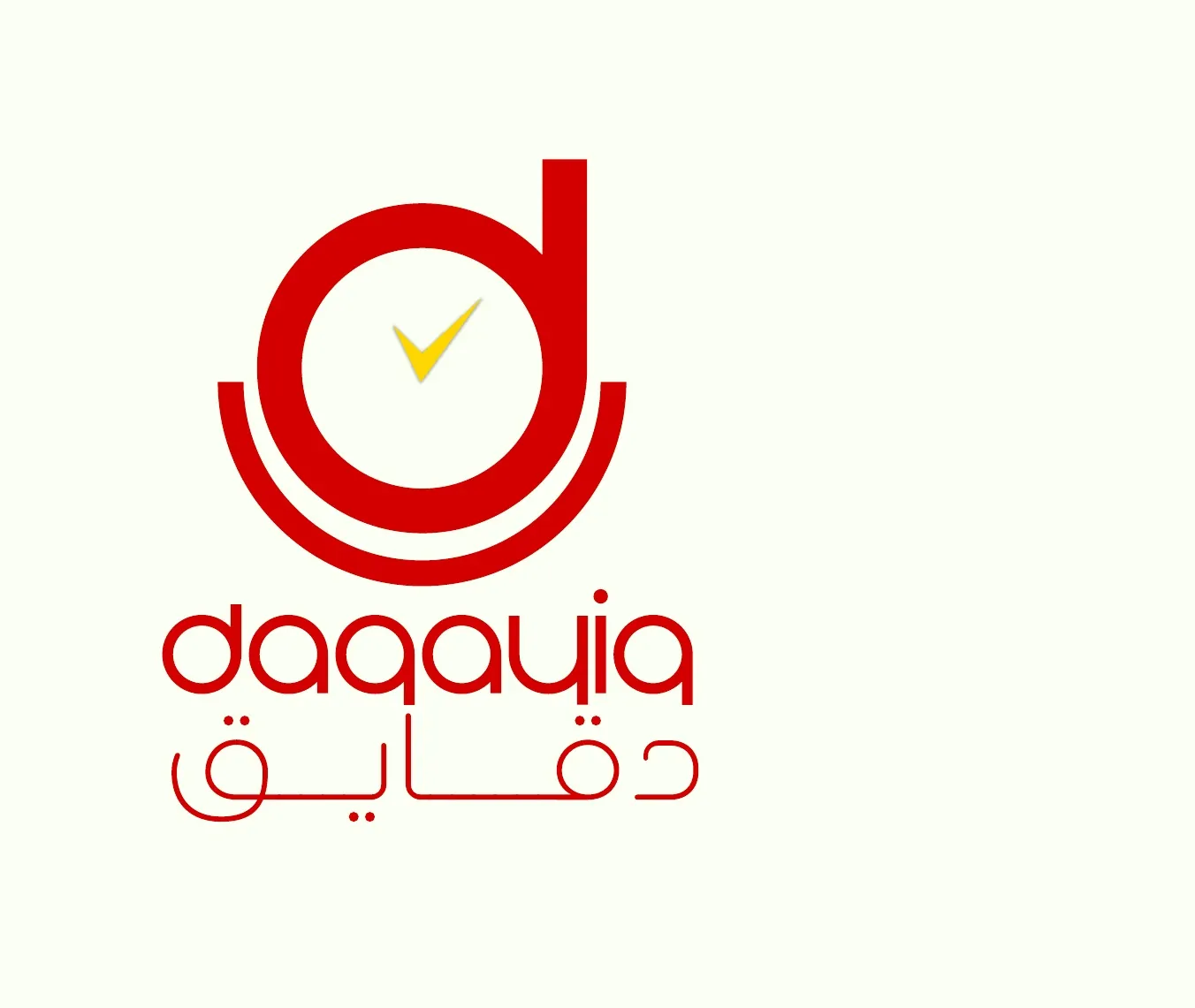
Daqayiq's identity connects the idea of time with a bright, directional graphic system. Red, yellow and ivory carry the brand across delivery applications, uniforms, printed materials and digital communication, grounded in an Omani context.
Brand strategy · Visual identity · Applications · Digital assets
02 / BRAND
Local character, contemporary expression
The strategic direction positions Daqayiq as a contemporary Omani delivery brand. Local context informs the story, while clear design and movement give it an outward-looking expression.
03 / GRAPHIC SYSTEM
Time becomes a graphic language
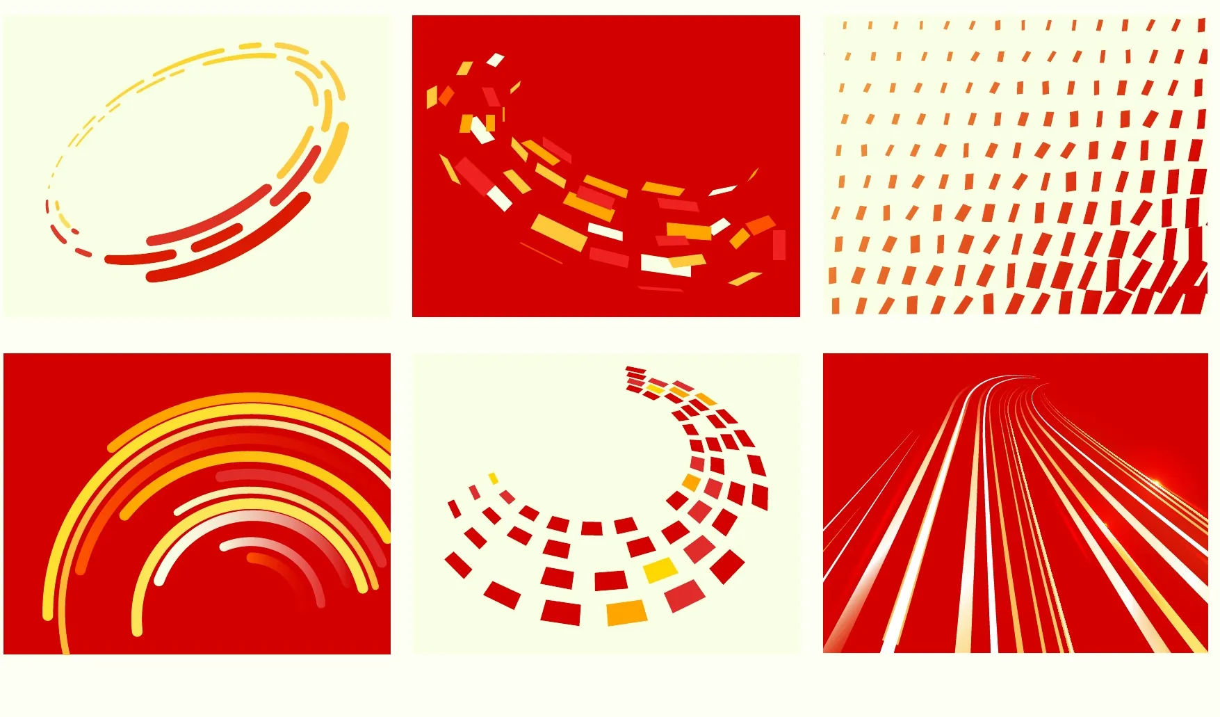
Arcs, repeated marks and directional lines extend the logo's circular language. They can suggest pace without depending on a literal delivery photograph in every composition.
04 / COLOUR
Bright, with a clear hierarchy
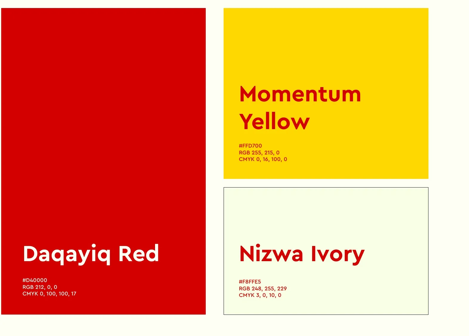
Red and yellow establish the principal contrast, balanced by ivory space. Archivo and Noto Kufi Arabic support readable bilingual applications.
05 / STATIONERY
The identity at work
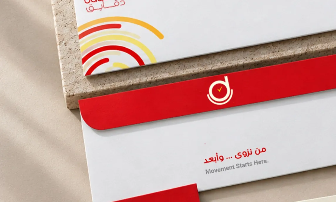
Printed forms and stationery apply the system to practical business material. Consistent placement and graphic details connect the functional pieces with the wider brand.
06 / DELIVERY
A presence across delivery touchpoints
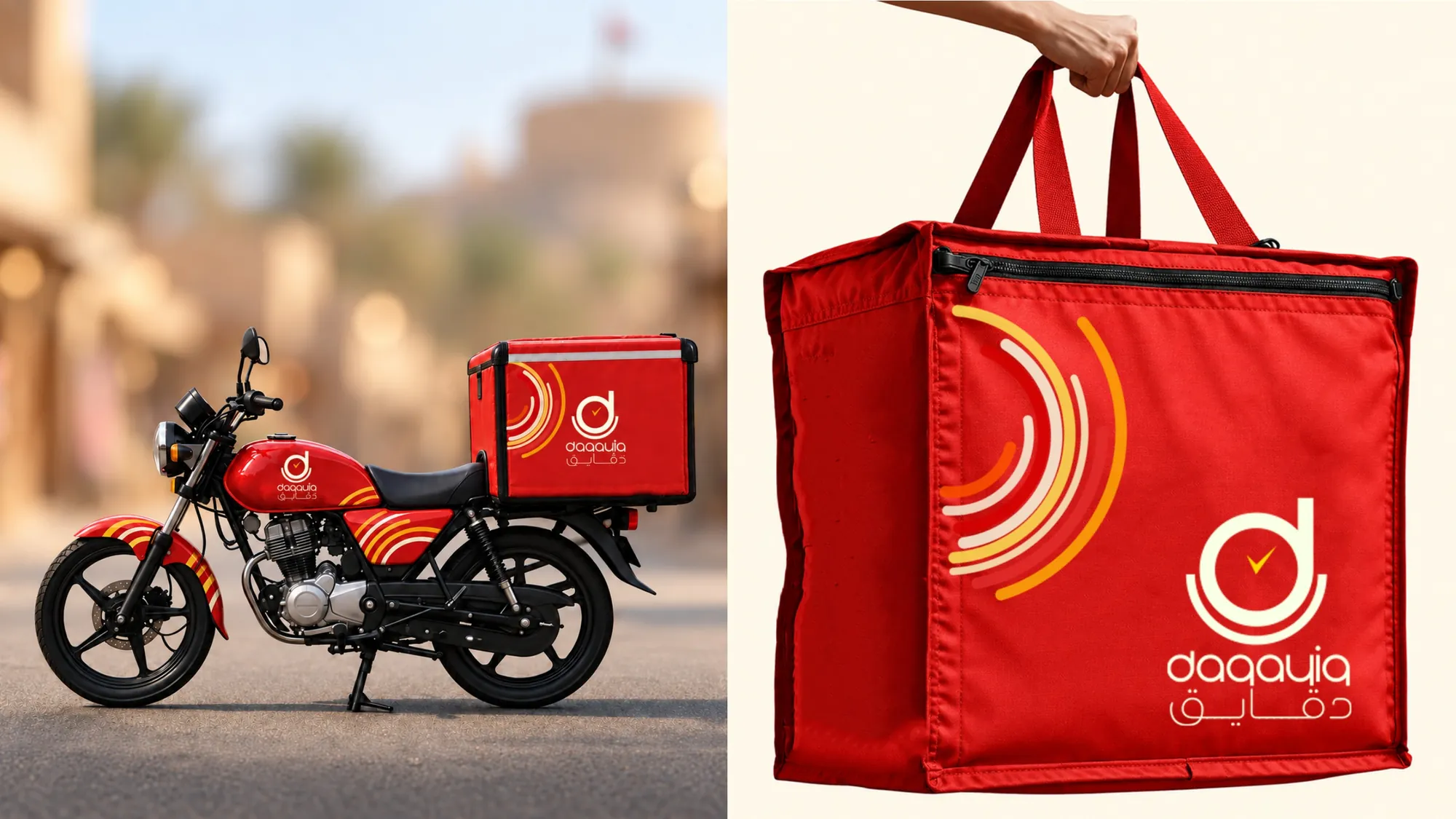
The application concepts explore vehicles, delivery bags and uniforms. Each uses the same recognisable colour and mark while adapting to a different scale and surface.
07 / DIGITAL
The same energy on screen
Social compositions carry the brand's directional rhythm into short messages and product-led scenes. Digital assets extend the same vocabulary to smaller screen-based touchpoints.
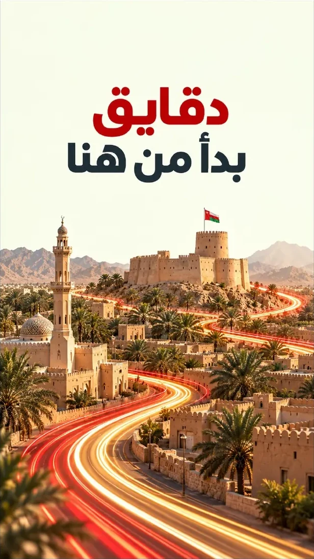
A shared rhythm, across every expression.
NEXT PROJECT
HOPTIRE ↗VIEW ALL WORK