
CASE STUDY / HOPTIRE
HOPTIRE
A RECOGNISABLE ROADMATE.

SCROLL TO EXPLORE ↓
01 / THE PROJECT
HopTire's identity brings tyre services into a direct, recognisable visual system. A wheel-led wordmark, green palette and repeatable graphic elements connect vehicles, uniforms and everyday communication.
Visual identity · Graphic system · Applications
02 / IDENTITY
The wheel becomes a signature
A wheel detail gives the name a recognisable centre. The identity carries that same circular language into supporting elements.

03 / GRAPHIC SYSTEM
A system with movement
Wheel-derived patterns and directional graphics create variation within the green palette. They can lead a composition or support a smaller brand detail.

04 / UNIFORM
Recognisable at the point of service
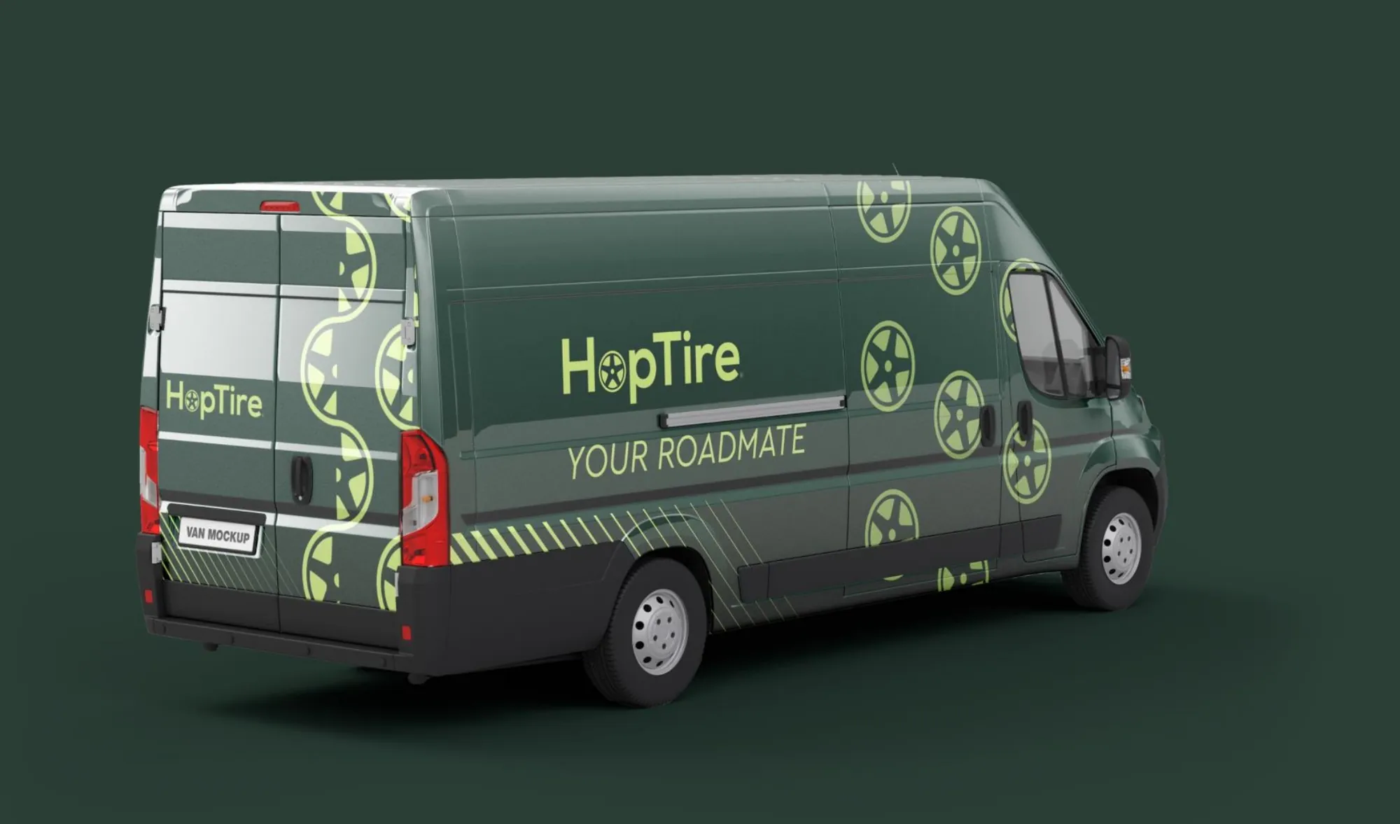
Vehicle graphics and uniforms bring the identity into the service environment. Clear marks and colour blocks keep the applications connected without repeating one layout.

05 / PRINT
The same voice in smaller formats
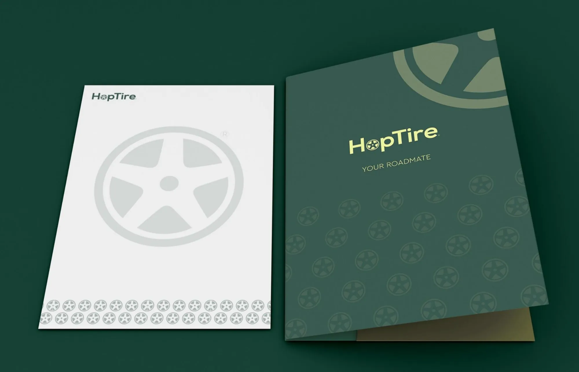
Folders and stationery translate the system into practical formats, retaining the contrast and graphic character of the larger applications.
One identity, across the service experience.
NEXT PROJECT
DAQAYIQ ↗VIEW ALL WORK