
CASE STUDY / GUTERA
GUTERA
A DISTINCTIVE PRESENCE ON THE PACK.

SCROLL TO EXPLORE ↓
01 / THE PROJECT
Gutera pairs an expressive wordmark with a dark green packaging world. The system brings the name, product information and botanical imagery into a focused composition.
Visual identity · Packaging
02 / WORDMARK
Character in the lettering
The wordmark works in both a horizontal and stacked arrangement. Its letterforms give the identity a recognisable character before supporting imagery is introduced.
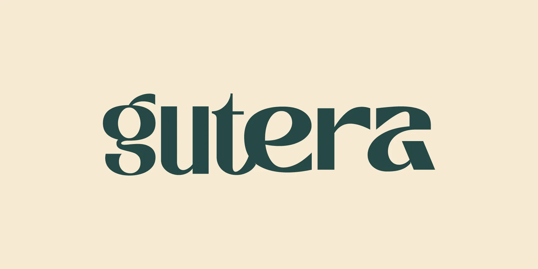
A focused identity, built around the product.
NEXT PROJECT
ASSI ↗VIEW ALL WORK