
CASE STUDY / JOVANA
JOVANA
A NEW ERA OF KUWAITI ELEGANCE.

SCROLL TO EXPLORE ↓
01 / THE PROJECT
A complete rebrand for a Kuwaiti fashion label, built to make modern elegance coherent across physical and digital touchpoints.
Strategy · Rebranding · Visual Identity · Digital · Print
02 / CONTEXT / STRATEGIC DIRECTION
Premium without distance.
Jovana needed one clear expression of quality, detail and modern Kuwaiti elegance across the brand experience.
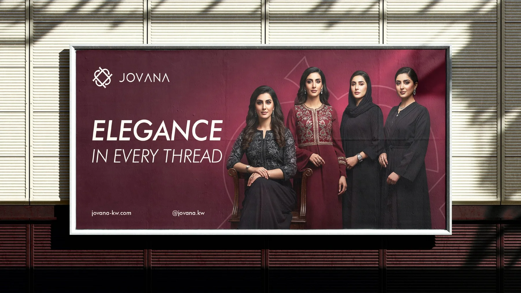
03 / IDENTITY / MONOGRAM
Detail becomes the signature.
A precise monogram and responsive lockups give the identity a recognizable center without competing with the clothes.
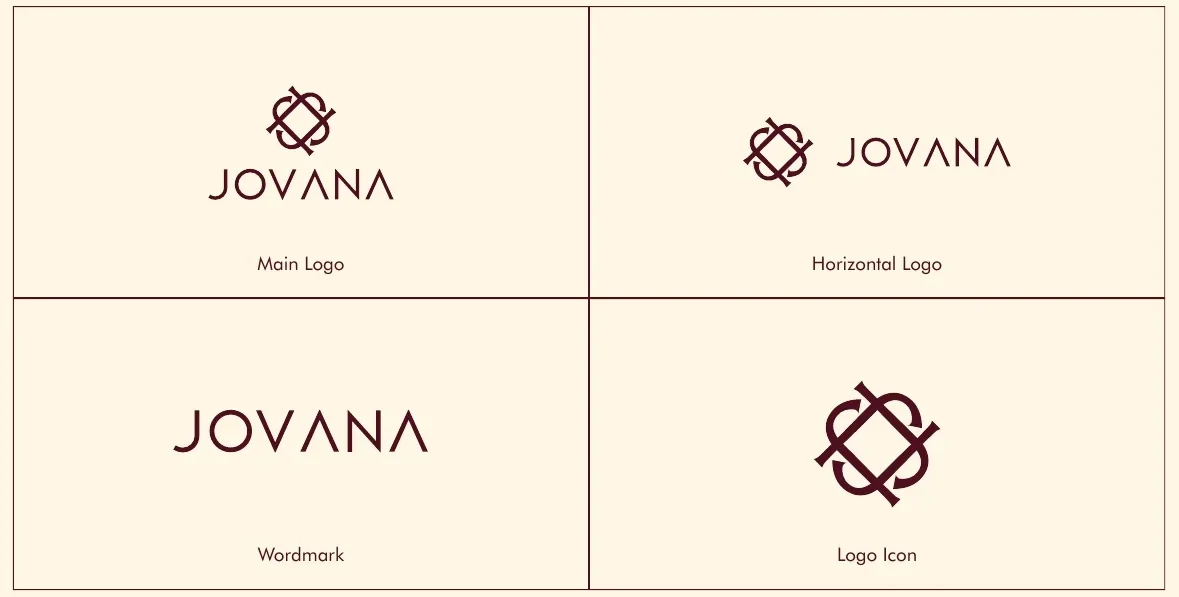
04 / COLOR + TYPOGRAPHY
Blackberry, cream, restraint.
A restrained palette and bilingual hierarchy carry the same elegant tone from headlines to small functional details.
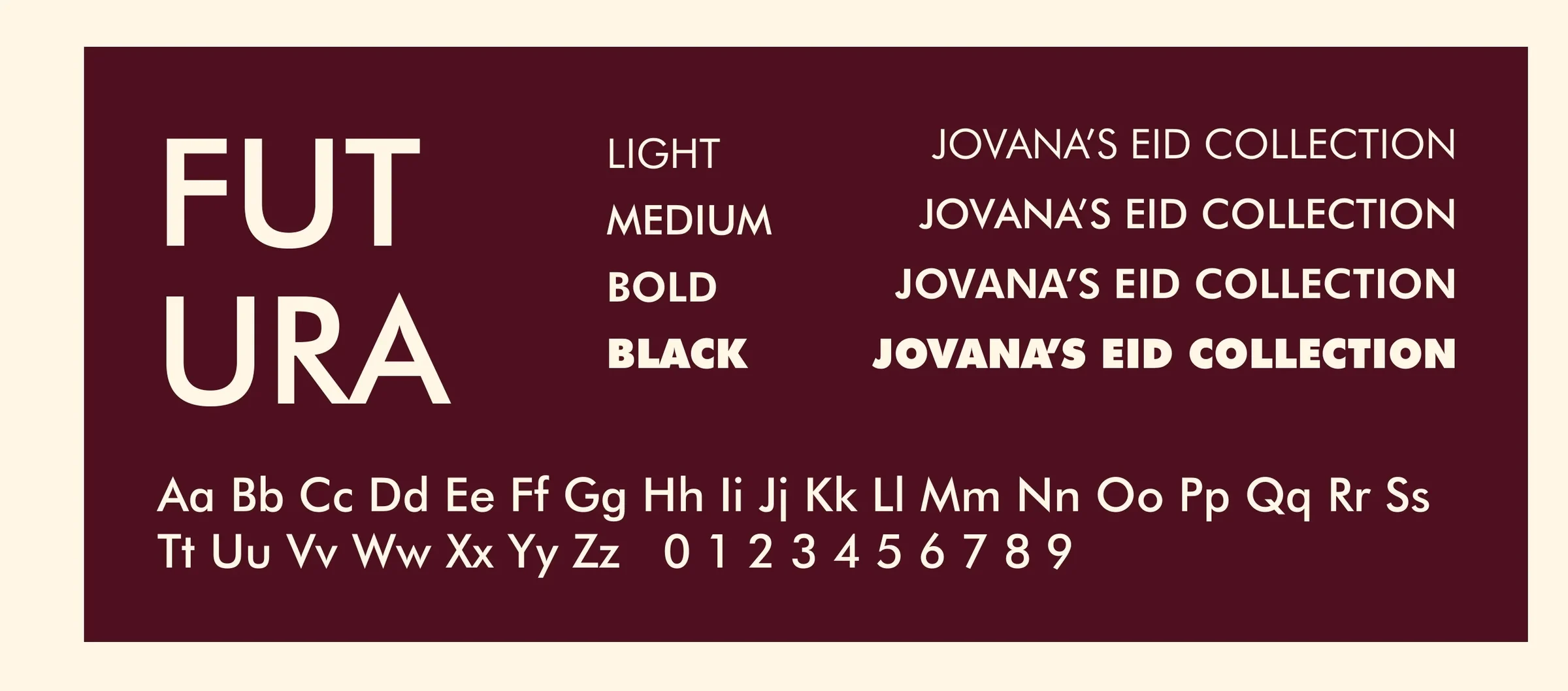
05 / PHOTOGRAPHY
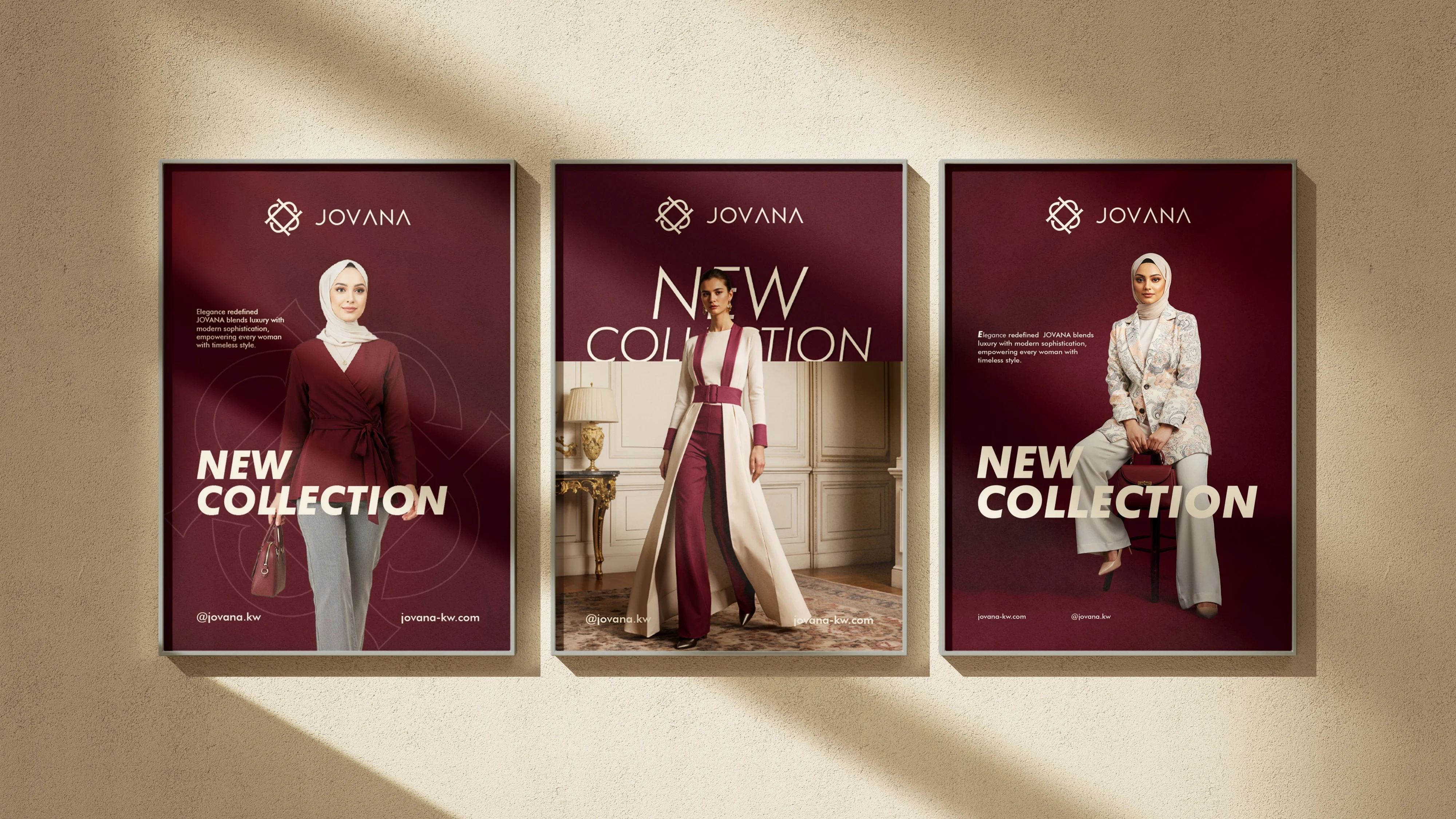
Fashion leads the page.
The photography direction places the garment and the woman at the center, using the monogram as a quiet spatial frame.

06 / GRAPHIC LANGUAGE
One mark, a wider rhythm.
The monogram expands into crops and patterns that can frame content without turning every application into the same composition.

07 / DIGITAL
An editorial screen language.
Digital applications preserve the same hierarchy, palette and image behavior in a more immediate format.

08 / PRINT + PHYSICAL
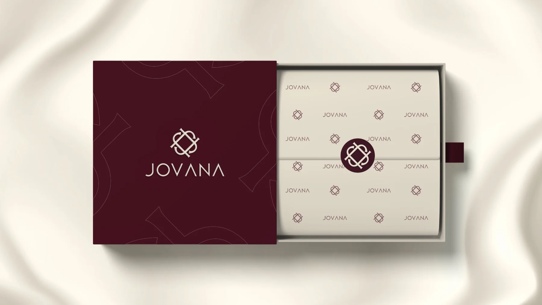
The identity enters the wardrobe.
Packaging, printed pieces and fashion touchpoints extend the system into the moments customers hold and wear.
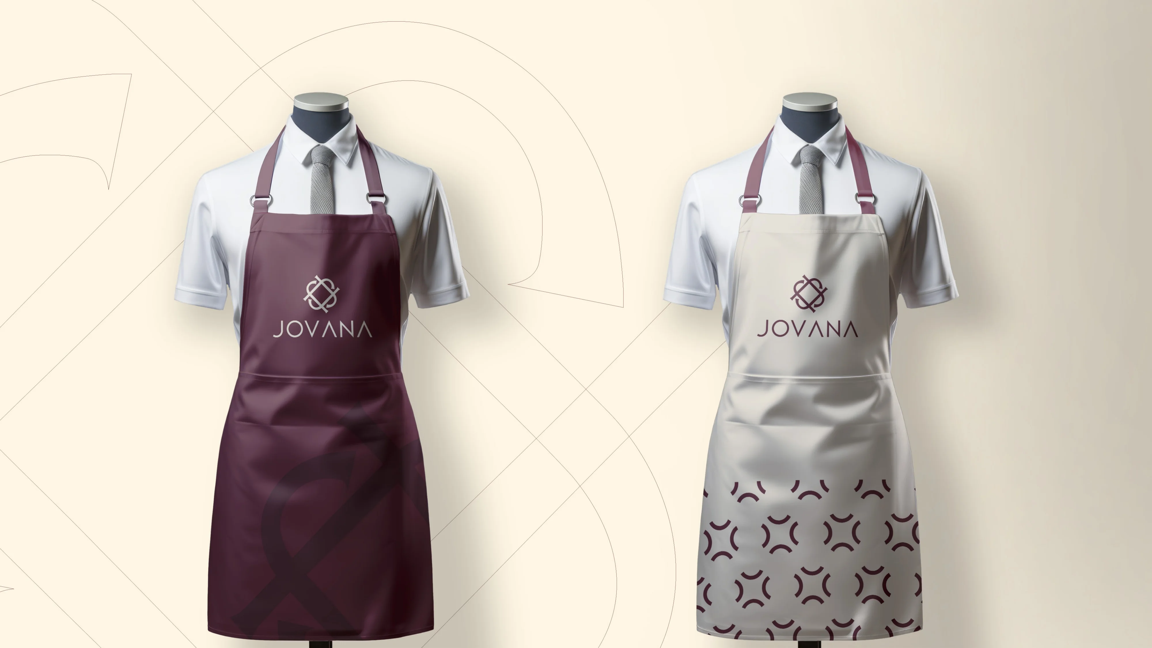
09 / CAMPAIGN REACH
A consistent public presence.
Campaign formats use the approved photography and graphic language as the final expression of the system.
NEXT PROJECT
EGYPT GENOME ↗VIEW ALL WORK