CASE STUDY / SIGHT EYE CLINIC
SIGHTEYE CLINIC
CLARITY, THROUGHOUT THE EXPERIENCE.

SCROLL TO EXPLORE ↓
01 / THE PROJECT
Sight's visual system pairs a distinctive eye symbol with a restrained blue and silver-grey palette. Repeated curves, bilingual typography and consistent applications create a clear presence across clinical stationery, signage and communication.
Visual identity system · Print · Communication
02 / IDENTITY
A symbol with a wider vocabulary
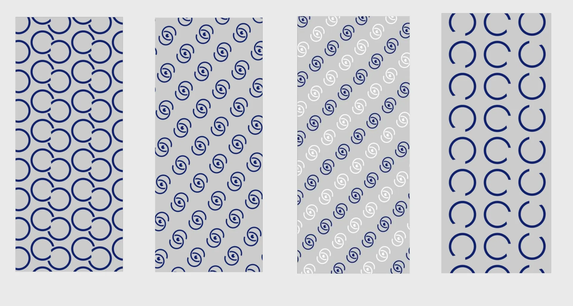
The eye symbol anchors the system. Its curved forms recur in borders, patterns and larger graphic fields, linking functional information with recognisable brand details.
03 / TYPOGRAPHY
A shared bilingual hierarchy
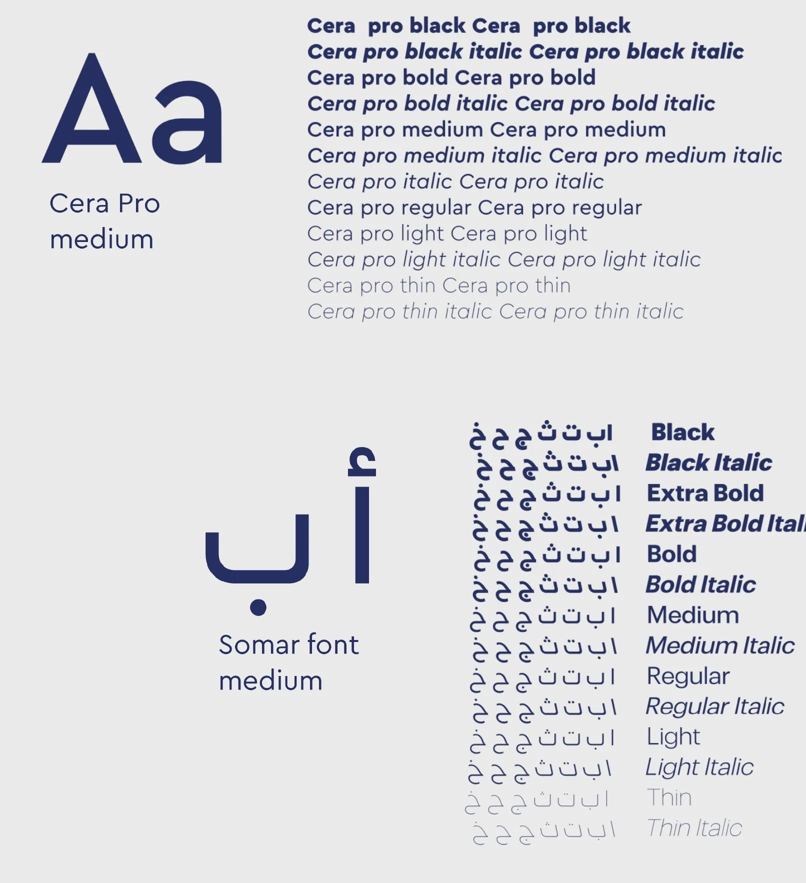
Arabic and English typography establish a consistent hierarchy for headings and practical information. Blue and silver-grey support the same tone across both languages.
04 / PRINT
Identity in everyday details
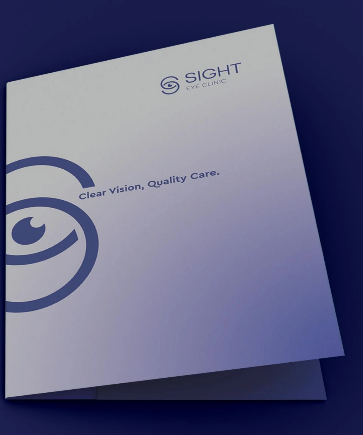
Prescription sheets, folders and business cards bring the identity into recurring points of contact; the presentation folder is shown here. The symbol changes scale without losing the relationship between the pieces.
05 / SIGNAGE
A clear point of arrival
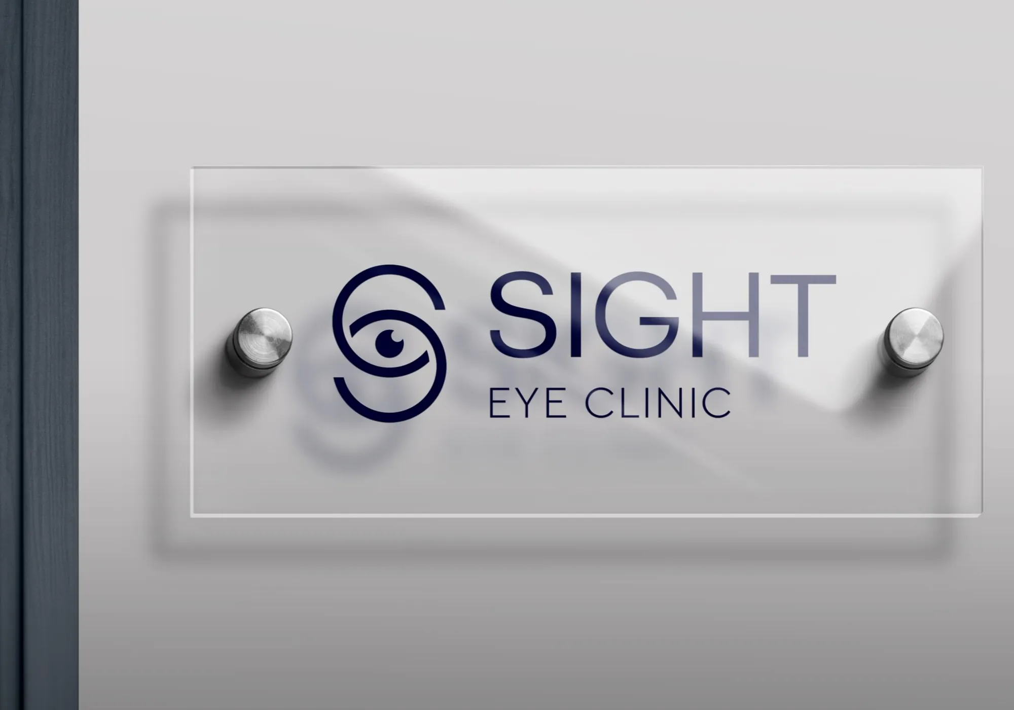
The sign application places the name and symbol in a simple, readable composition. It gives the visual system a physical expression beyond the page.

A consistent identity, down to the details.
NEXT PROJECT
SOLANA ↗VIEW ALL WORK