CASE STUDY / SOLANA
SOLANA
A WARMER EXPRESSION OF DENTAL CARE.

SCROLL TO EXPLORE ↓
01 / THE PROJECT
Sunlight and a smile meet in Solana's identity. A warm palette, a simple symbol and a consistent visual language connect the clinic's everyday materials, from patient files to uniforms and signage.
Visual identity · Brand guidelines · Applications
02 / BRAND IDEA
Sun meets smile
The symbol combines two simple cues: sunlight and a smile. Together, they give the brand a warm visual starting point without relying on a literal tooth illustration.

03 / GRAPHIC SYSTEM
Warmth, with structure
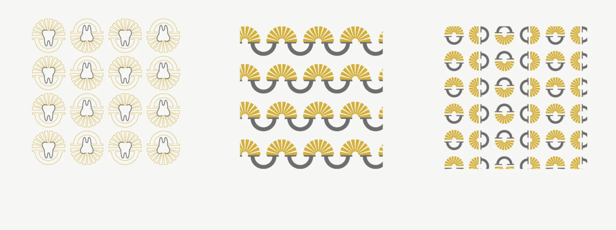
Muted gold and grey work alongside generous light areas. Repeated shapes create a recognisable graphic system around practical information.
04 / UNIFORMS
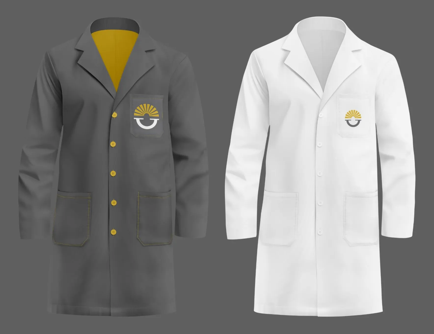
From paper to place
Uniform applications extend the system into the clinic environment. The mark stays simple and legible at different scales.

A warm identity for the details of care.
NEXT PROJECT
SIGHT EYE CLINIC ↗VIEW ALL WORK