
CASE STUDY / SYOM
SYOM
RETURN TO NATURE. REFINED.
SCROLL TO EXPLORE ↓
01 / THE PROJECT
A product-led rebrand for an Iraqi herbal tea, built around a distinctive pack, natural ritual and consistent premium world.
Rebranding · Visual Identity · Product · Packaging
02 / REBRAND / CONTEXT
Move beyond category codes.
SYOM needed to feel natural and trustworthy without blending into the familiar visual language of wellness products.
03 / IDENTITY
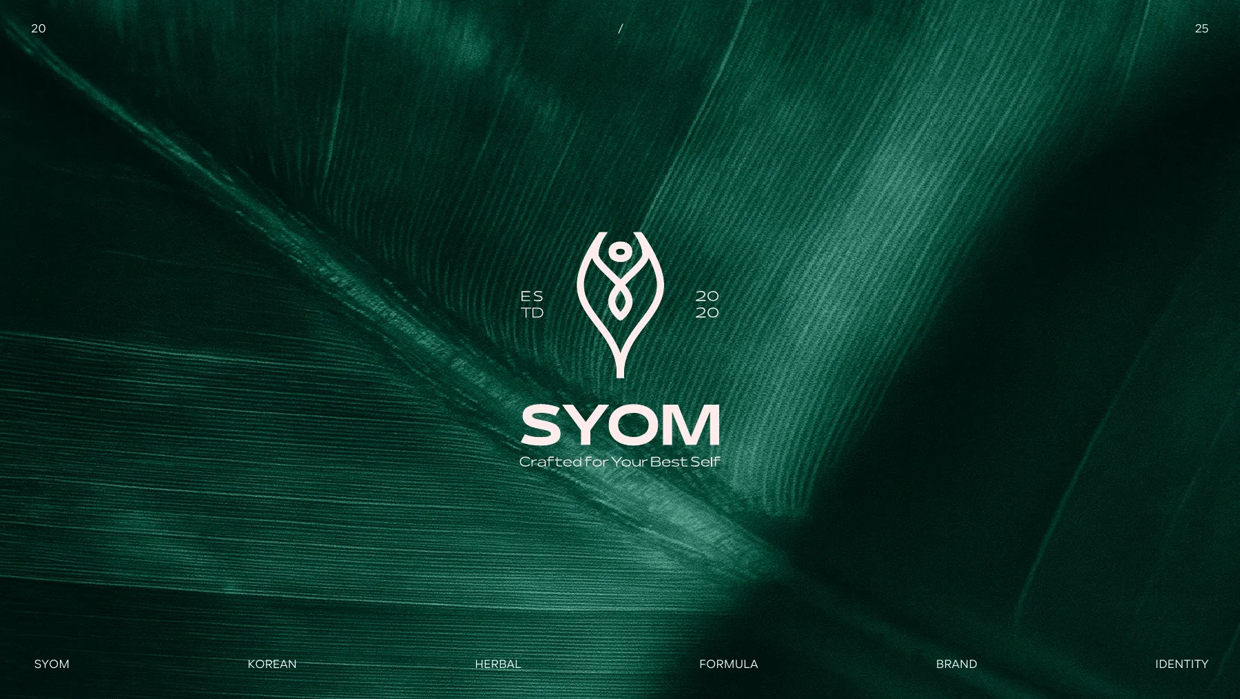
Nature with structure.
A leaf-built emblem and a restrained wordmark give the product a clear focal point across scales.
04 / VISUAL LANGUAGE
Emerald, gold, ritual.
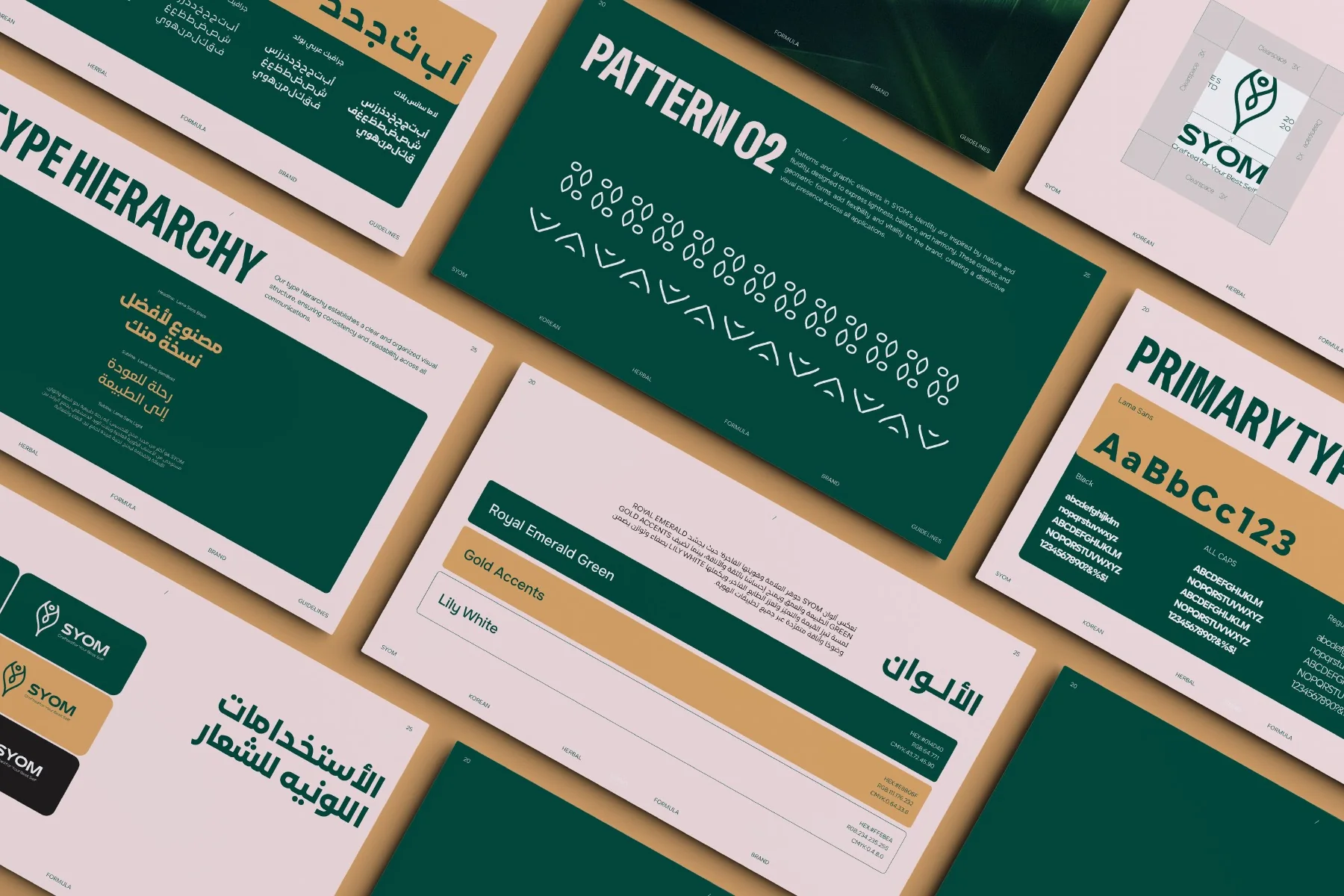
Color, texture and botanical form create a premium natural world without relying on health-result claims.
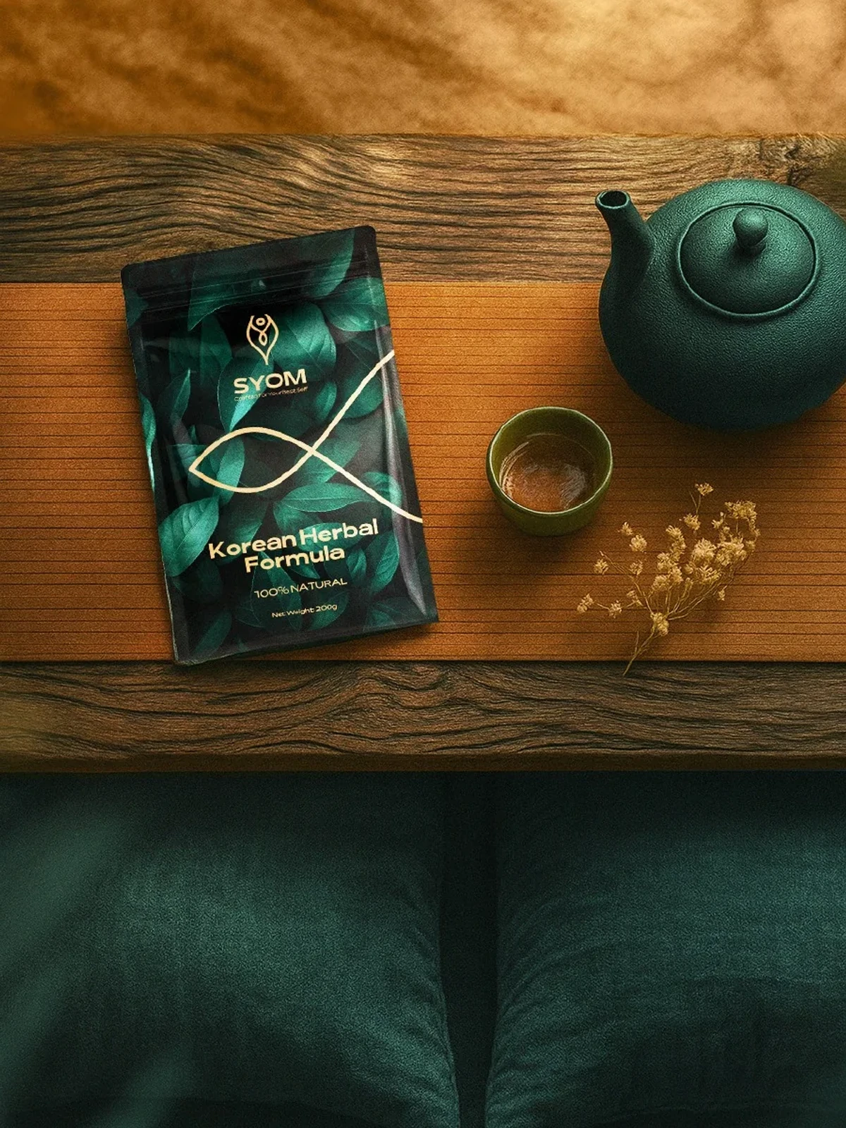
05 / PRODUCT
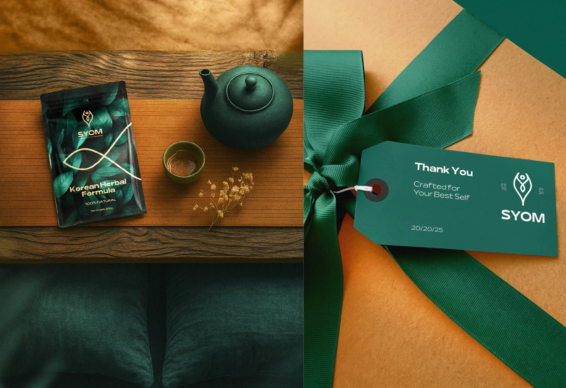
The pack is the protagonist.
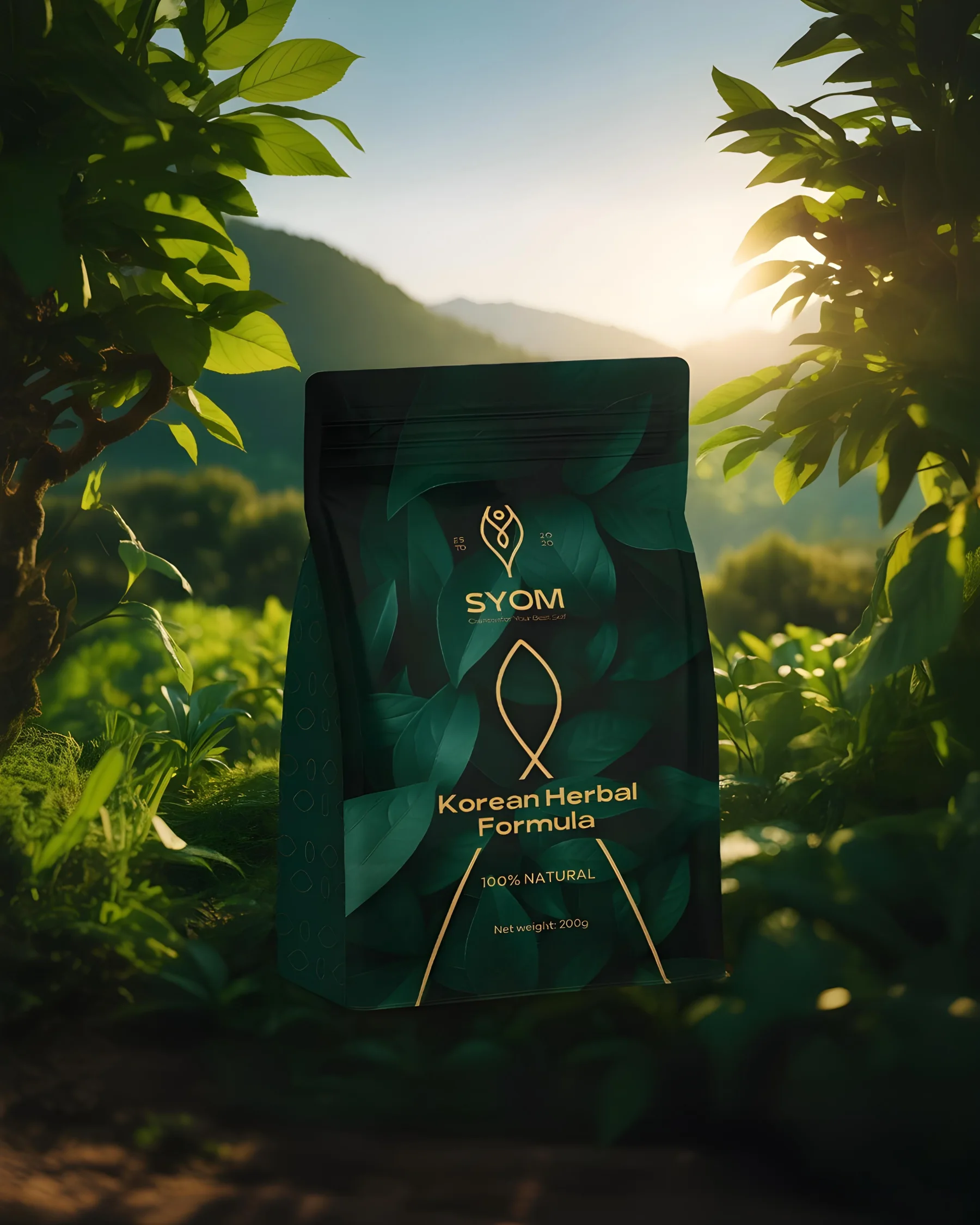
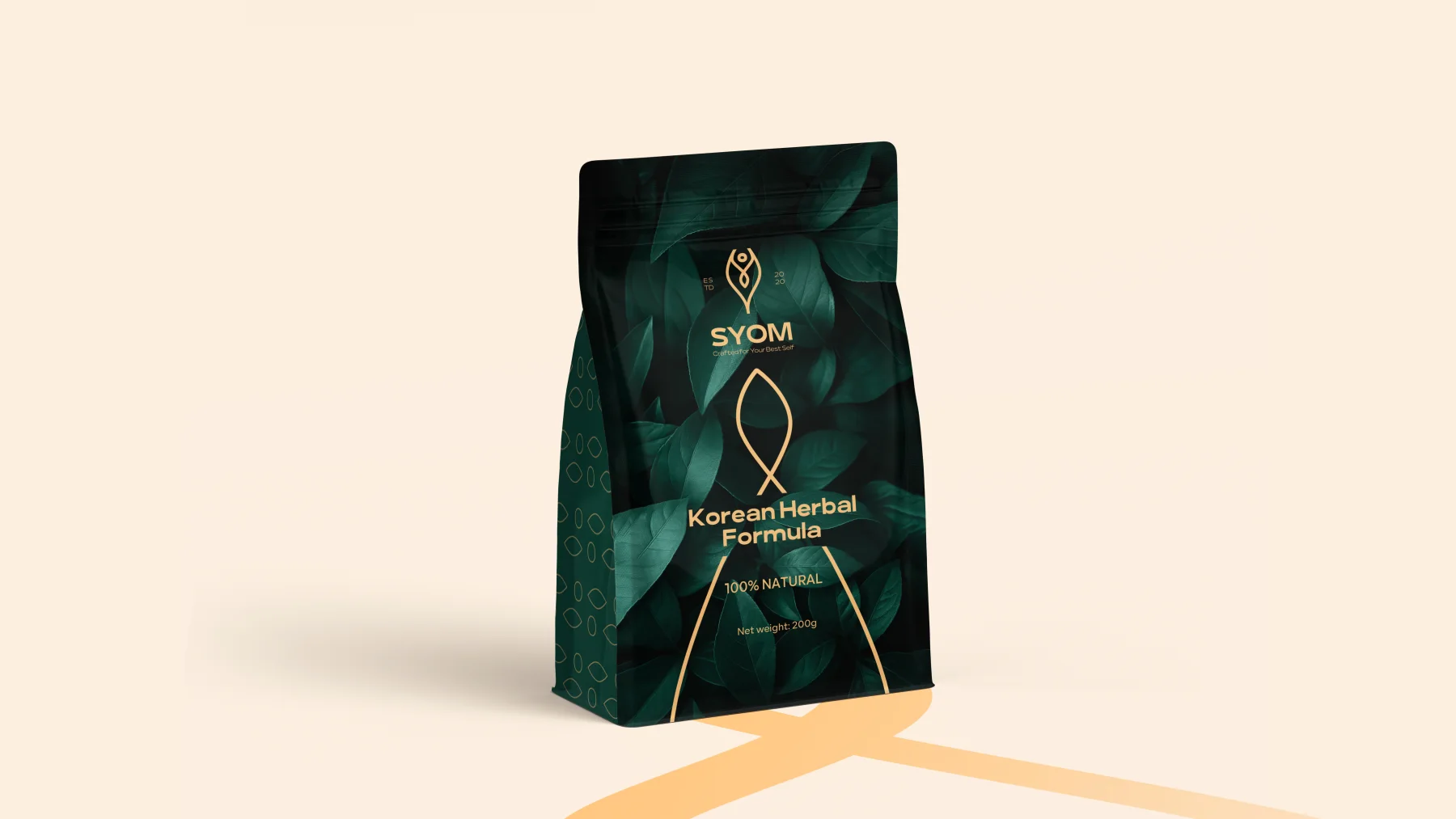
Real product presence carries the identity into the moment of selection and makes the brand immediately recognizable.
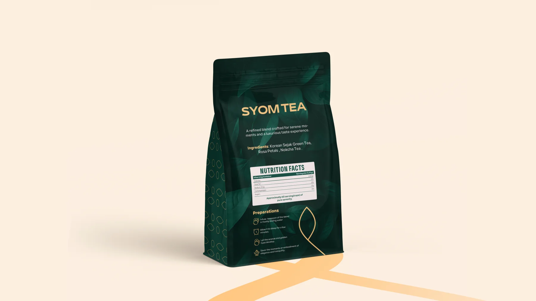
06 / PACKAGING SYSTEM
Front, back, one clear system.
The packaging balances brand impact, product information and functional hierarchy across both faces of the pack.
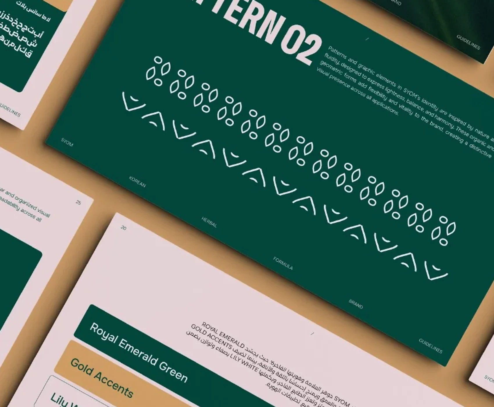
07 / GRAPHIC SYSTEM
A botanical grammar, not a guideline gallery.
The pattern and typography support product recognition rather than becoming the subject of the page.
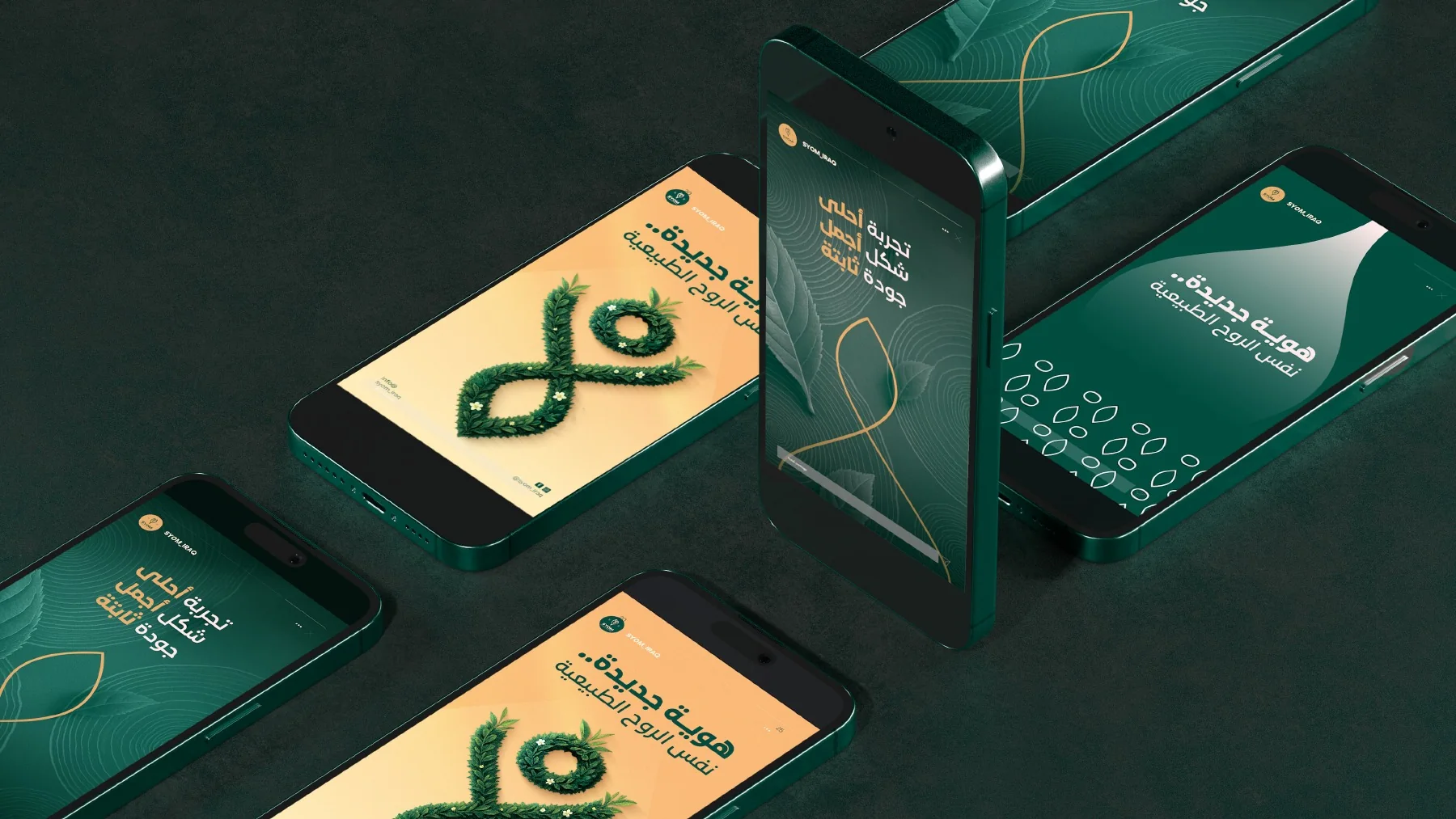
08 / DIGITAL COMMUNICATION
The product remains visible.
Digital communication extends the ritual and palette while keeping the pack at the center of attention.
09 / PHYSICAL / GIFT APPLICATIONS
A ritual that can be held.
Gifting and physical details carry the same emerald and gold world into the product experience.
NEXT PROJECT
SOFRATI ↗VIEW ALL WORK