
CASE STUDY / TEAMWORK
TEAMWORK
WHERE TRUST MEETS TALENT.

SCROLL TO EXPLORE ↓
01 / THE PROJECT
A bilingual identity for an Arabic freelancing platform, built around digital clarity and the human connection behind every project.
Strategy · Visual Identity · Product Touchpoints · Illustration
02 / CONTEXT
Make digital collaboration feel human.
The brand needed to speak to freelancers and project owners at once, connecting a digital transaction to a dependable working relationship.
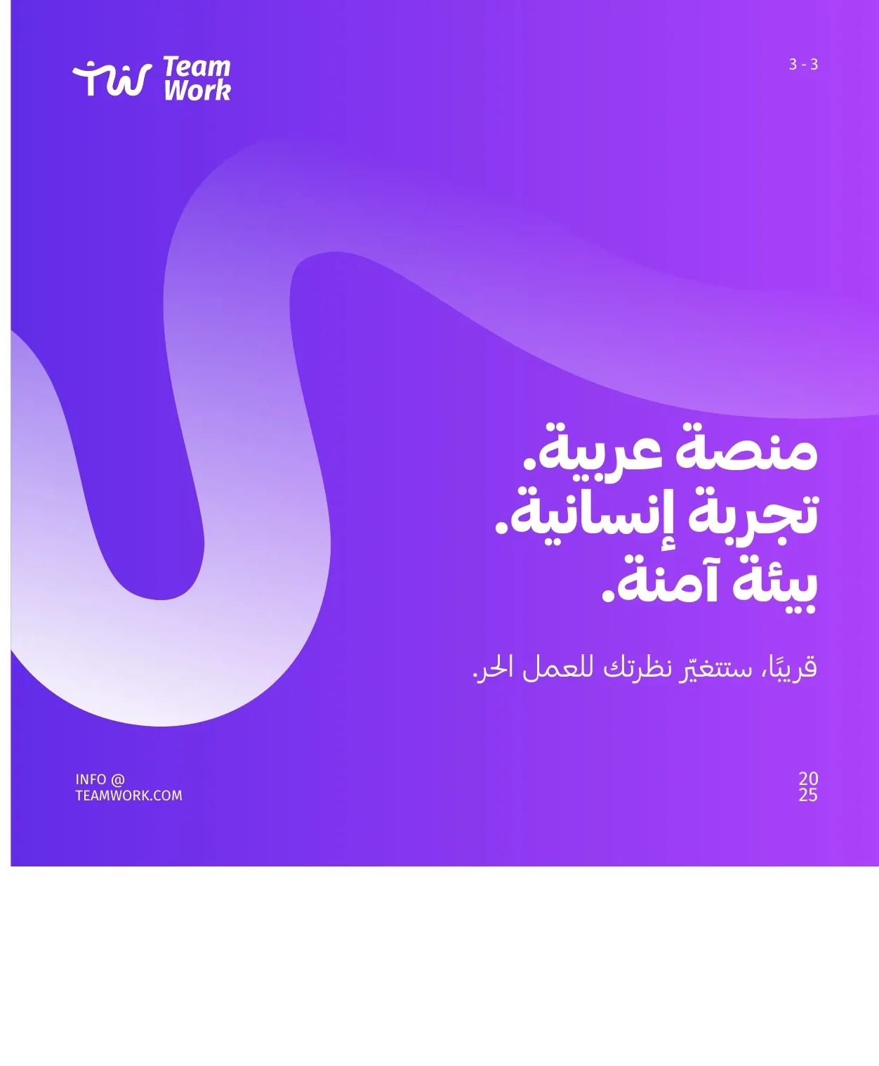
03 / IDENTITY
Connection, made visible.
A compact bilingual mark establishes the platform before the wider graphic world begins.
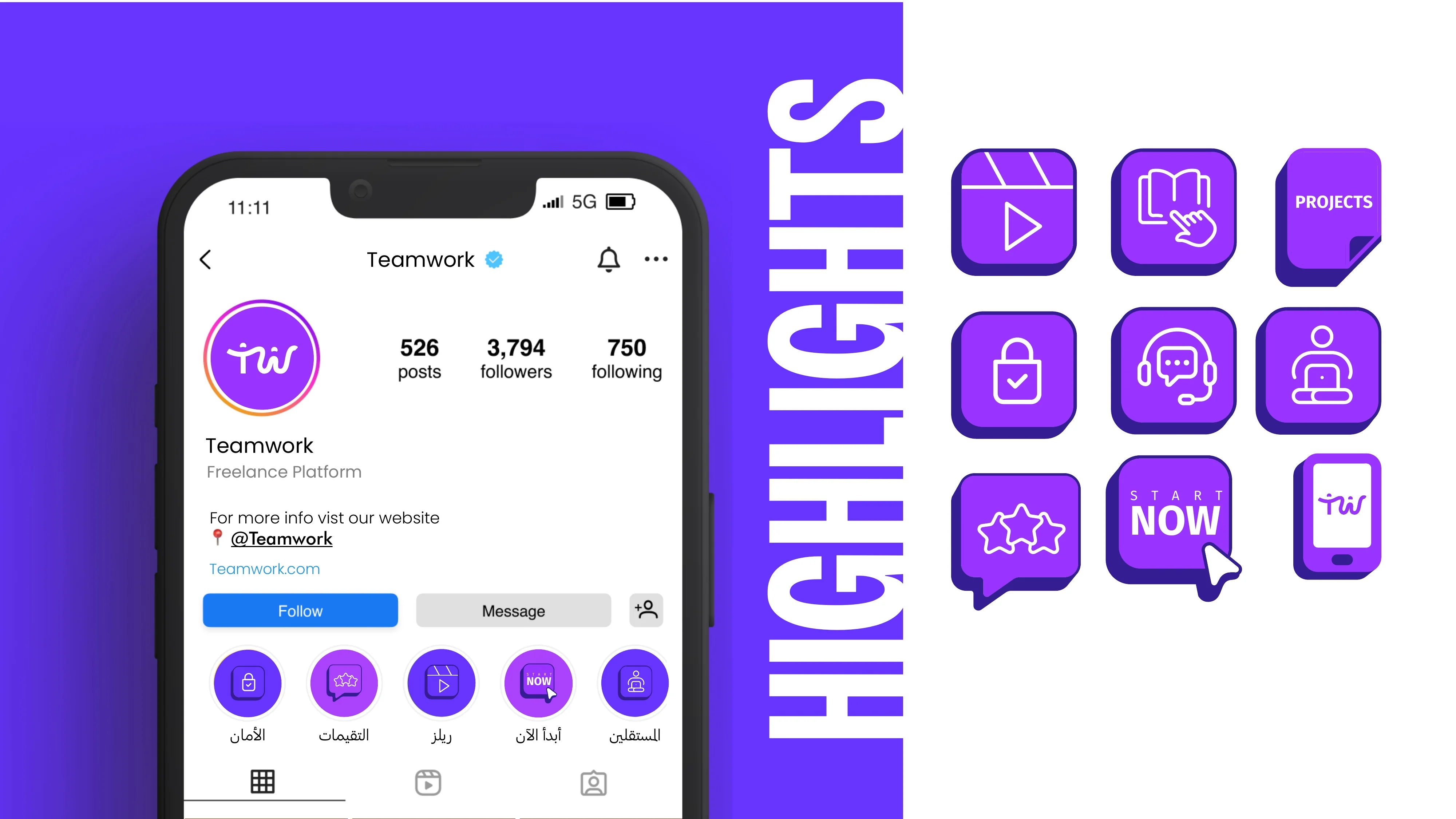
04 / PLATFORM / PRODUCT EVIDENCE
The product comes before the graphics.
Profile and interface evidence make the platform’s role legible before illustration becomes the dominant voice.
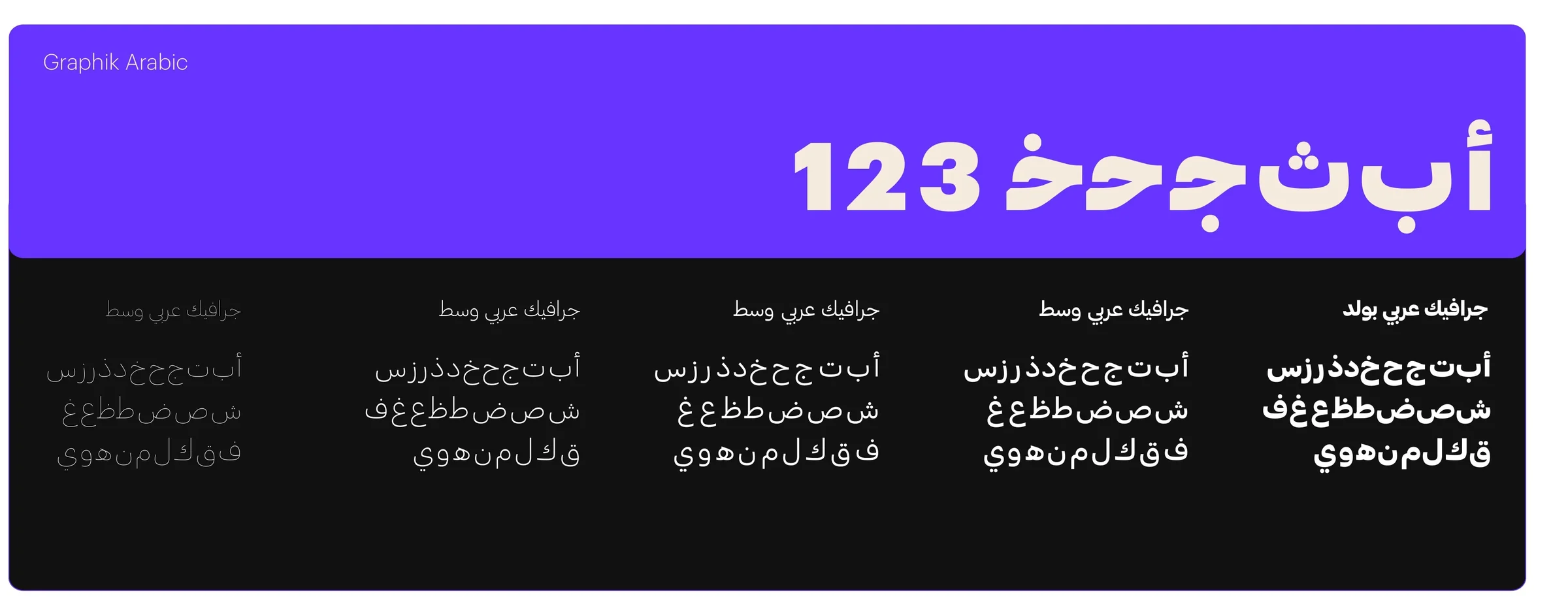
05 / COLOR + TYPOGRAPHY
A vivid, readable bilingual voice.
Purple carries energy and recognition while the type system keeps English and Arabic communication direct.
06 / GRAPHIC SYSTEM
Different parts, one connected field.
Organic connected forms become a flexible pattern for product, print and communication applications.

07 / ILLUSTRATION SYSTEM
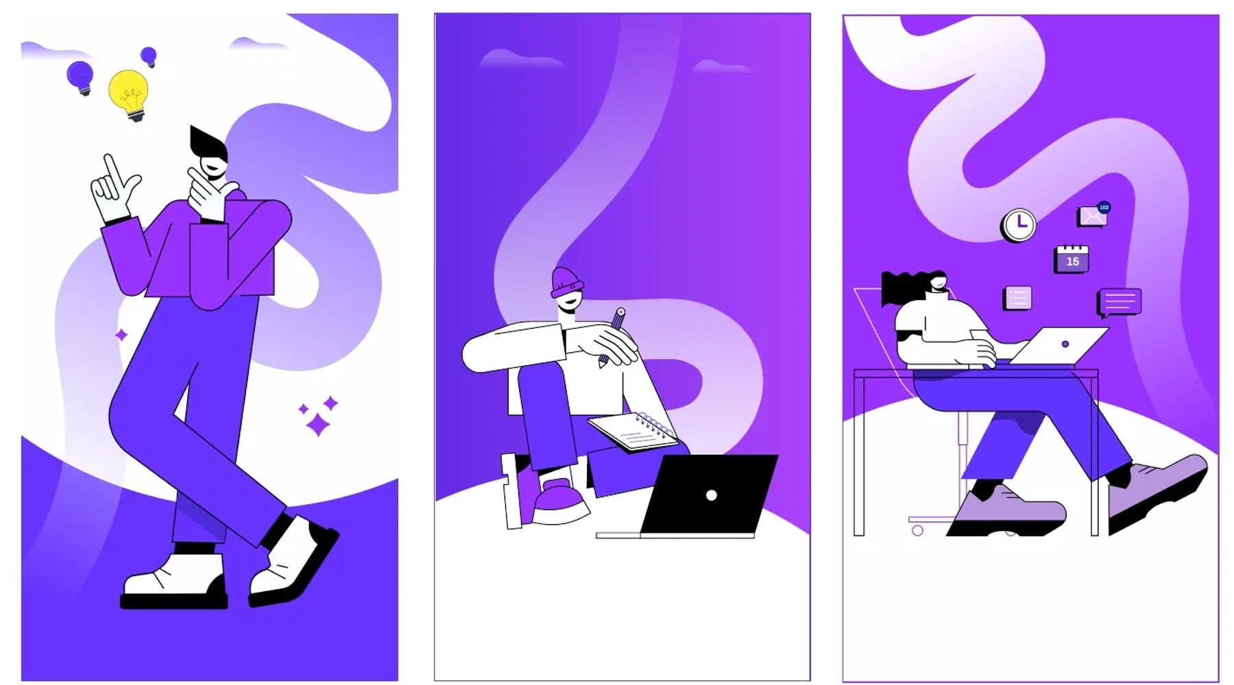
People return to the center.
An illustration family gives freelancers and project owners a human presence without obscuring the platform itself.
08 / COMMUNICATION / SOCIAL
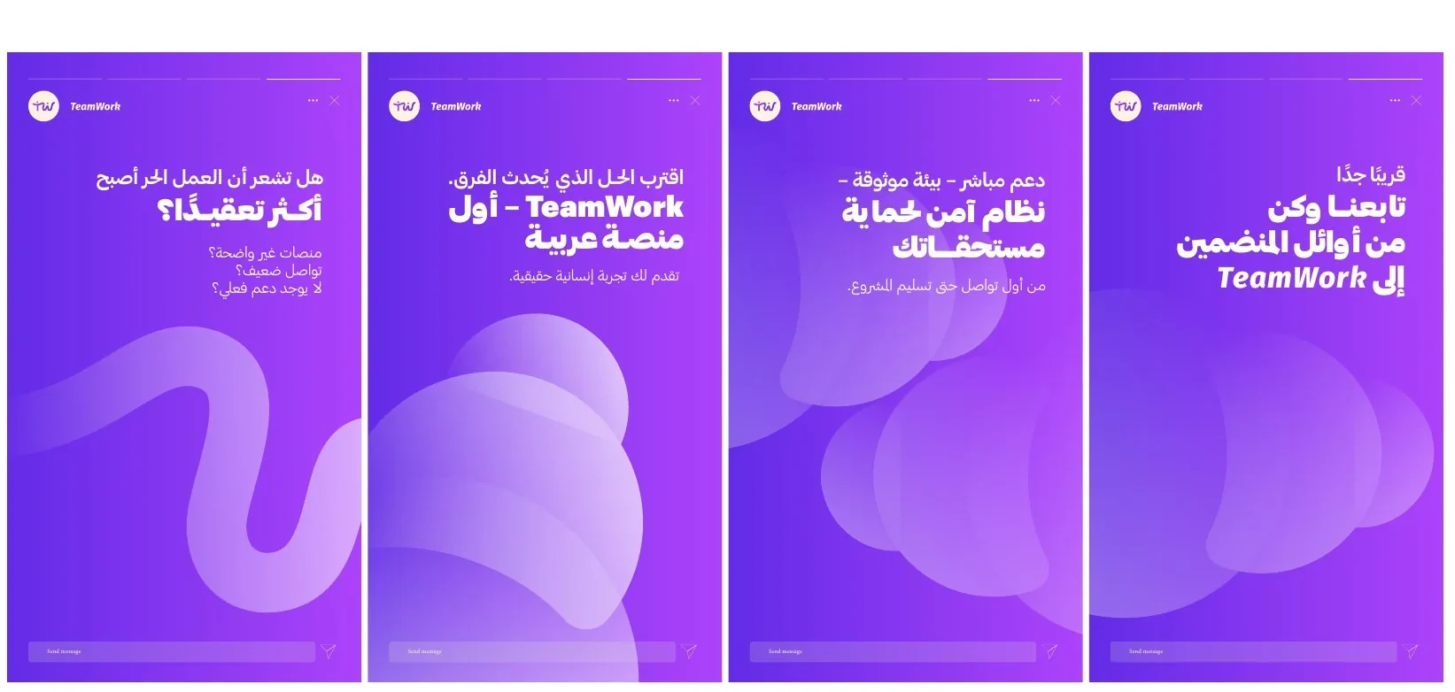
A system built to keep speaking.
Social formats combine message, pattern and illustration within a repeatable but varied communication grammar.
09 / APPLICATIONS
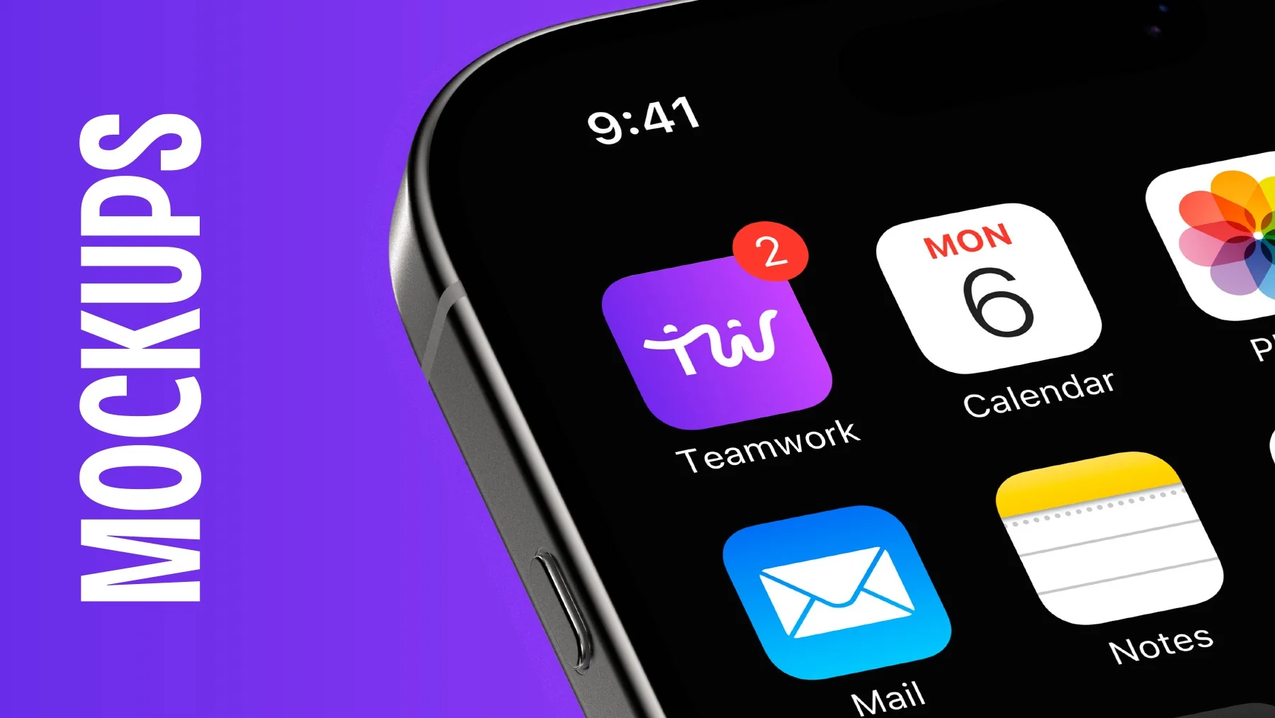
From screen to everyday use.
Product and physical applications carry the same energetic identity into the platform’s wider brand world.

NEXT PROJECT
JOVANA ↗VIEW ALL WORK